Filtering by Category: Inspiration

Artist Group at the Berkeley Free Market Building

Added on by Lara Hoke.

I was honored to be part of the inaugural meeting of an artist group yesterday evening in downtown Berkeley. We met in Sarah Haba's studio which is located in the Berkeley Free Market Building.  The studio is beautiful and teeming with history.  The Berkeley Free Market Building was the studio home of Bay Area Figurative artists Richard Diebenkorn, Elmer Bischoff, William Theophilus Brown, and Paul Wonner.  

Each artist presented their work and shared their motivations for joining the group. Seeing the quality and variety of the other artists' work was absolutely inspiring!

The tie that binds the group is that each artist has taken a class with Mel Prest.  She has done us all a huge favor in recognizing and acting on the importance and need for artists to have community. We will be meeting once a month for critiques, conversation, and community.

In other news, I've begun prep work on several beautiful birchwood panels from Kevin Keul.  These panels were built to order for commissioned portraits.  
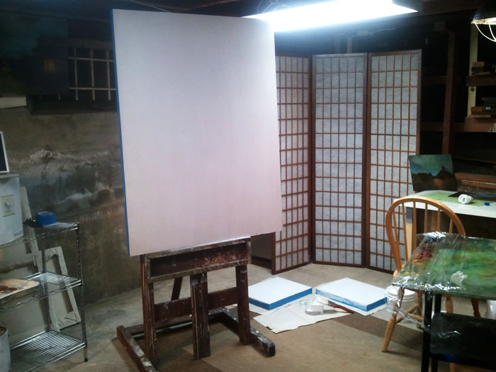
Preparing the birchwood panels

W.P.A. Inspired Wedding Invitations

Added on by Lara Hoke.

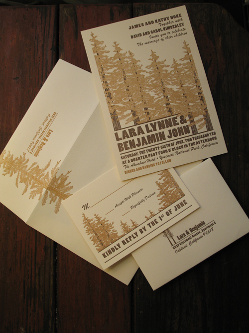
W.P.A.-inspired wedding invitations

Last fall I wrote about W.P.A. Posters and mentioned how Ben and I met with artist/printmaker Kim Vanderheiden, founder of Painted Tongue Studios to explore the possibilites of making W.P.A.-inspired wedding invitations. 

We were so impressed with Kim and Painted Tongue Studios that we happily jumped right in.

Kim and her team were a joy to work with. She facilitated a relationship between us (client) and her (vendor) that felt like a true collaboration- that we were equally invested in the outcome.  

Ben and I love how the invitations capture our aesthetic and the spirit of the location (Yosemite).


Euan Uglow

Added on by Lara Hoke.

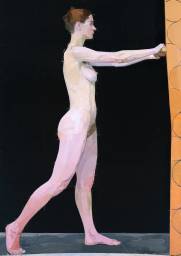
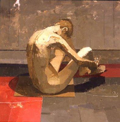
I painted for the first time in 1997. I was sixteen years old, and incredibly lucky to have Rick Weaver (whom I will touch on in a future post) as my teacher.  He is an excellent educator and an incredibly talented artist. Rick taught me about color and form and light and shadow. He also introduced me to the work of Euan Uglow, an artist who's strong, elegant, and clean work reminds me daily of why I paint.

Uglow was born in the early 1930s and was a part of the  20th Century British Realist Painters school who's members include such extraordinary names as Lucian Freud, William Coldstream, David Hockney, Frank Auerbach, Francis Bacon, Peter Blake, R.B. Kitaj, and Leon Kossoff. 

He taught at Slade School of Art until his death in 2000 and is best known for his work in the figure. His compositions are ostensibly simple, but belie a complex geometry. Planes are articulated precisely, edges are sharply defined, and colors are differentiated with great subtlety.

His method of painting was meticulous and his paintings took months and often years to complete. The surfaces of his paintings are checkered with many small horizontal and vertical markings. These are the remnants of plum lines, the coordinates he used to verify two dimensional relationships against against three dimensional reality.

Among the artists most influential to Uglow are Matisse, the Venetians, Cezanne, Poussin, and Ingres.
All images copyright Euan Uglow.


The Paintings of Mary Beth McKenzie

Added on by Lara Hoke.

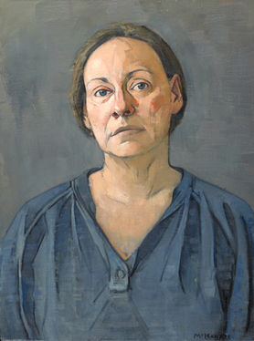
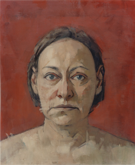
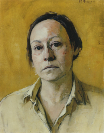
A few years ago someone remarked that my style of painting reminded them of the paintings of Mary Beth McKenzie and I very much appreciated the compliment!  Mary Beth McKenzie is an accomplished oil painter who's work is owned by many public institutions including the Metropolitan Museum of Art, the National Museum of American Art, the Smithsonian Institute, the Brooklyn Museum, the New Britain Museum of American Art, the National Museum of Women in the Arts, the Butler Museum of American Art, the Museum of the City of New York, the National Academy of Design and the New-York Historical Society.

She also teaches at the Art Students League of New York and the National Academy of Design, what I wouldn't give to take a class from her and pick her brain!

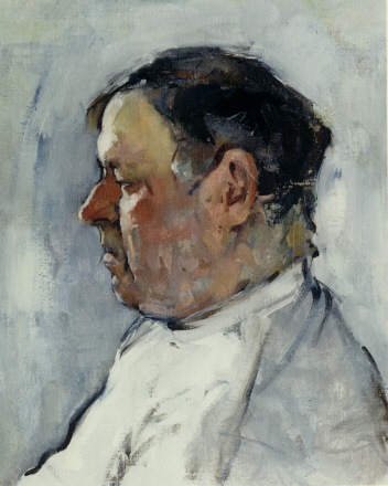
Her application of paint and the use of color to build form reminds me of the landscapes of Cezanne. Contributing to the quality and solidity of her shapes is incredibly careful measuring. I love how she leaves the traces of plum lines. They serves as a window into her painting process and constant reminders of her hand.

All images copyright Mary Beth McKenzie.


The Paintings of Keinyo White

Added on by Lara Hoke.

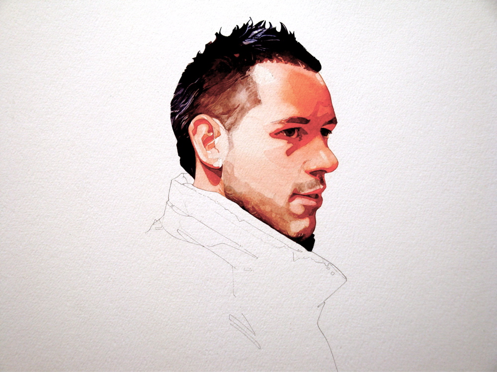
I'm excited to share with you the beautiful paintings of Keinyo White. I am particularly drawn to his work in watercolor, a medium not often associated with the figure, let alone contemporary gallery quality art.

White's paintings give just enough information and are never over-worked. His seamless combination of line and form is especially impressive.

And his portraits walk that impossibly fine line - they capture  the personality and qualities of the sitter while not compromising the intention and hand of the artist.

http://www.keinyowhite.com
http://www.keinyowhite.com/blog


All images copyright Keinyo White.

WPA Posters, Fine Art or Graphic Design?

Added on by Lara Hoke.

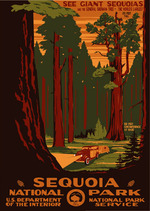
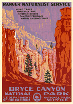
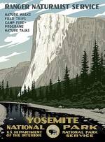
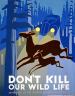
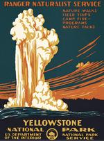
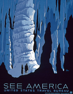
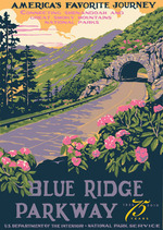
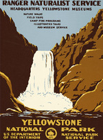
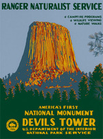
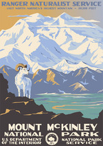
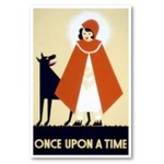
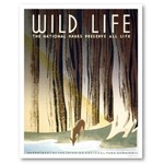
Between 1935 and 1943 the WPA's Federal Art Project printed over two million posters in 35,000 different designs to stir the public's imagination for education, theater, health, safety, and travel. I love these posters. They are great examples of the very gray space between graphic design and fine art, if such a space exists. 

Thanks to Ranger Doug Enterprises, these posters are available for purchase with a percentage of each sale going to returning these posters to the public domain. He has also added several contemporary poster designs to this collection at the request of the parks: Devils Tower, Bryce Canyon, Denali, Olympic, Mesa Verde and Hawaii. 

Ben and I are working with Kim Vanderheiden of Painted Tongue Studios  to translate the style and imagery of these posters for our Yosemite wedding invitations.